Article Link: https://www.newsweek.com/satellite-photos-ukraine-drone-attack-russian-airbase-1895062
Article Link: https://www.newsweek.com/satellite-photos-ukraine-drone-attack-russian-airbase-1895062
In this New York Times article from February 29, 2024, aerial photography is used to piece together the events that led up to the massacre of hundreds of civilians attempting to receive aid. The article references multiple examples of remotely sensed data. First, it references the drone footage published by the Israeli army. They note that this footage was spliced together and is missing key moments. Some of this footage is included in Figure 1.


In late January, one of the beaches close to my childhood home had a massive erosion event from increased sea levels and storms. All throughout my life, my family always avoided Wildwood beach because it took so long to walk to a water from the boardwalk, about a quarter mile. However, less then 10 years later, the water is only a few hundred feet away from the boardwalk. Because the beach is so long, no sand dunes were put in place to help protect against the rising ocean, which has no become a pressing issue. While there was a plan to start creating more dunes in 2017, the project never started, and a retaining wall, or bulkhead, had started to be built instead, but even that was scrapped. Because of the most recent storms and rising sea levels, a new bulkhead project was proposed, but it would only start in 2025 or later, leaving the beach's residents and businesses at the mercy of mother nature. In an article written about the beach and potential upcoming project, the writers include a single image of Wildwood beach, combined from an image from 1995 and another from late 2023. The two images are from one area, and have been scaled and matched evenly side by side so that the 1995 image shows the left most part of the area and the 2023 image shows the right part of the area. This allows us to be able to see the true extent of the sea level rise from where the two images meet, rather than using two images from the same exact area with the same nadir. From these images, it's easy to see how much of a threat there is to multiple buildings at the end of 2023, which will only continue to get worse.

The Destruction from the War in Ukraine


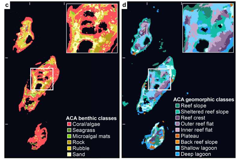
A 2024 study developed a method to predict reef biodiversity using remote sensing. Satellite imagery was used to develop maps that identify distinct marine habitats in the Fulaga Atoll of Fiji. This data was compared with measurements of the biodiversity of fish and coral collected by field researchers. The study found that areas of high habitat diversity had a positive correlation with areas of high biodiversity. The first of the four images below is a true-color image of the atoll, and the three following images are satellite-derived maps that assign a particular color to a distinct physical or biological region in the atoll. Areas of high habitat diversity have a relative abundance of colors per unit of area, and appear to have a more fine texture in which different colors are less distinguishable. Areas of low habitat diversity, on the other hand, have one or relatively few colors per unit of area, and are represented by single, smooth patches of color. A couple of regions, like ‘land’ and ‘sand’ are easy to identify in the true color image, but the maps make the habitats markedly easier to identify. This method could be used to infer measurements of biodiversity at other reef sites, at a much lower cost than deploying researchers in the field. 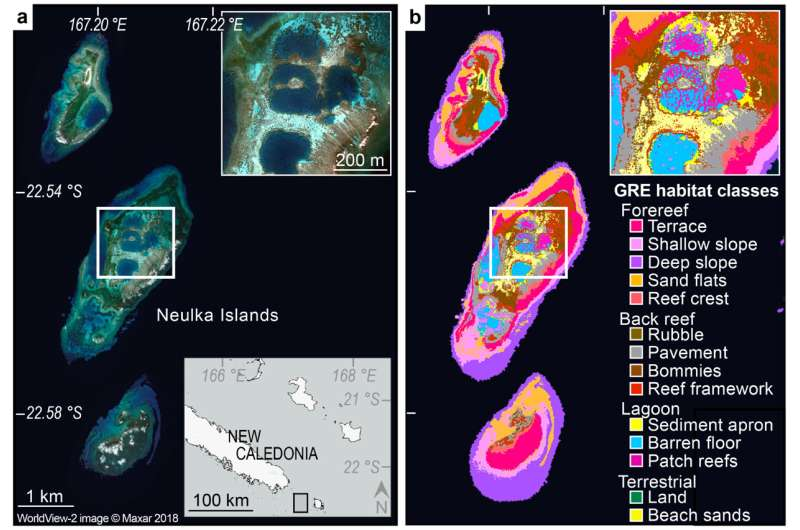
In December 2023, after the discovery of oil in the Essequibo Region of Guyana,
Venezuela, who has held claims to the region for centuries, passed a controversial
referendum to annex the region as a part of Venezuela, and seems to be planning
for a ground invasion to control the land. This article from the Guardian refers to a
report by the Center For Strategic And International Studies (CSIS), which talks
about the increase in military force near the Venezuela-Guyana border, through
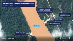
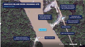
satellite aerial photos. Here we see six photos showing the increase in military
presence through two slides comparing aerial photos from before and now, and
two aerial photos. With this aerial information, a Venezuelan military invasion of
Guyana seems likely, unfortunately. Hopefully, things will de-escalate between the
two nations, and peace ensues.
The first image compares an area around Rio Cuyuni between December 2023 and
January 2024 toshow the change in usage. On the left we see the river in a natural
state, with sediment being carried by the river as natural, thus causing a brown
color. On the right, due to the passage of large vehicles, a ferrybarge, and storage
unit were built. The left shows mainly civilian usage, while the right shows heavy
military usage, and with the dirt runoff from the new storage sites, the color of the
river has changed to a gray color.
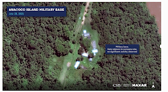
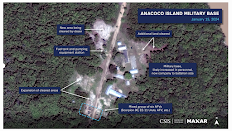
The second image compares the Ananoco Island military base in Venezuela from 2021
to January 2024. On the left, it shows a small platoon, with little movement and damage.
On the right we see a large military group, with many more barracks and field office
buildings. We even had a small base expansion, showing more military expansion.
Interestingly if you look at the ground, on the left it used to be grassy, due to low
usage, while now, it's much more dirt, due to the vehicle tracks and heavy use.
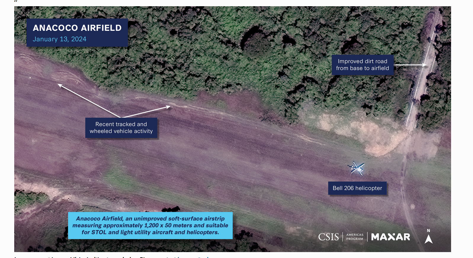
The third image shows the Anacoco Airfield as of January 2024, which is having a
surge in military activity, as seen by the tire tracks from the sensing imagery. Tire tracks
usually indicate recent plane activity, especially as seen on a dirt runway. We can see
a helicopter in this photo, showing more activity from the Venezuelan military.
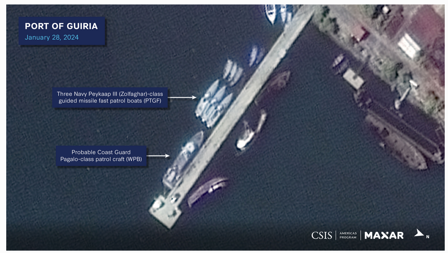
The last image shows the Port of Guiria as of January 2024, but you can see that the
usage of a Coast Guard port has increased significantly. You can see the size of the
Coast Guard fleet, with a large patrol boat, and three fast patrol boats, which all arrived
recently, according to the article. The boats in the back seem like small Coast Guard
boats are being replaced by bigger patrol boats. With the article stating that this port
will become a naval air station, it seems that the Venezuelan military will use this base
as a point to attack Guyana.
Article Link (Guardian): https://www.theguardian.com/world/2024/feb/09/venezuela-
troops-guyana-border-essequibo-satellite-images
Article Link (CSIS): https://www.csis.org/analysis/miscalculation-and-
escalation-over-essequibo-new-insights-risks-venezuelas-compellence
Feb 08, 2024
Yulong Jiao


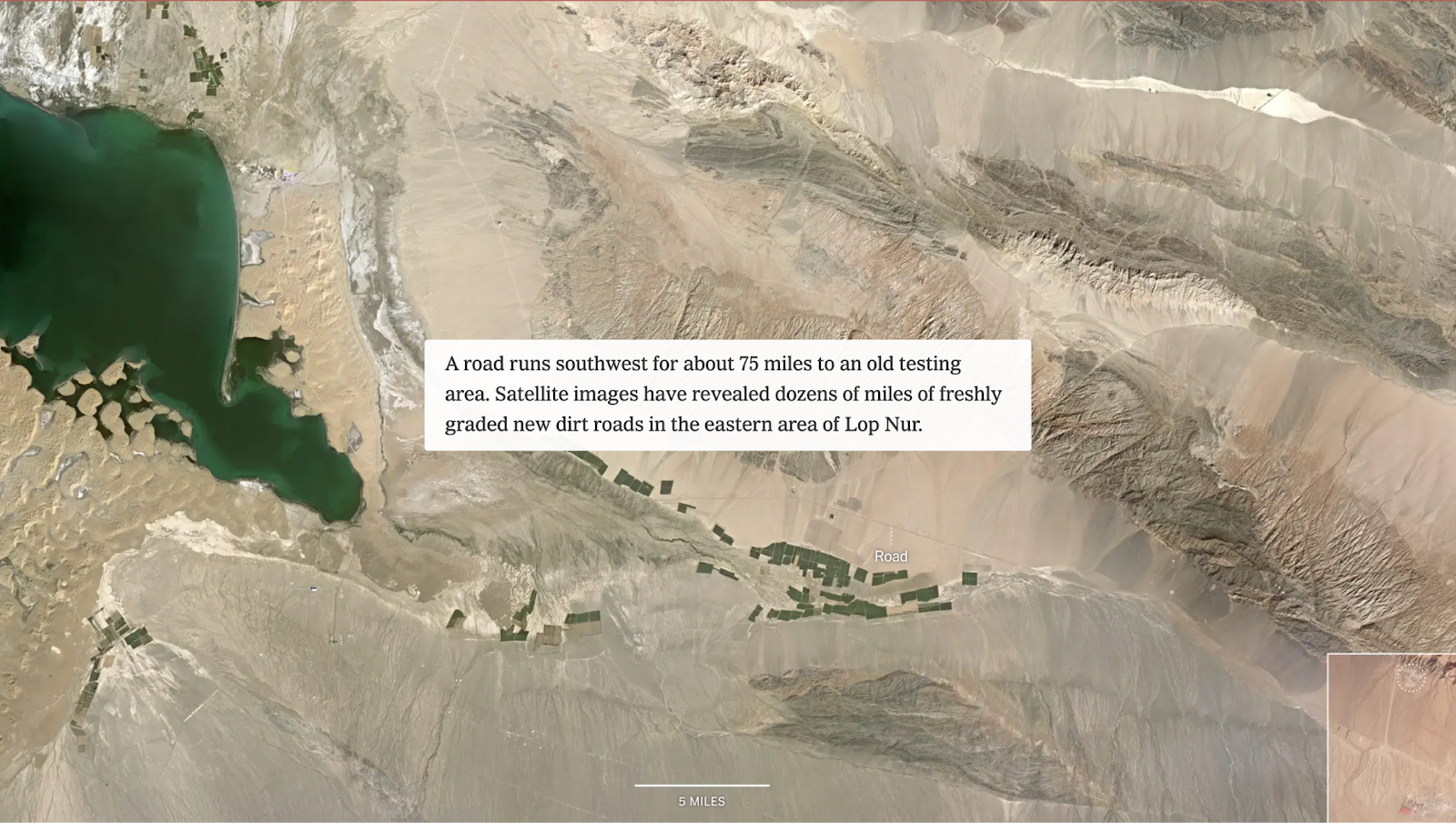
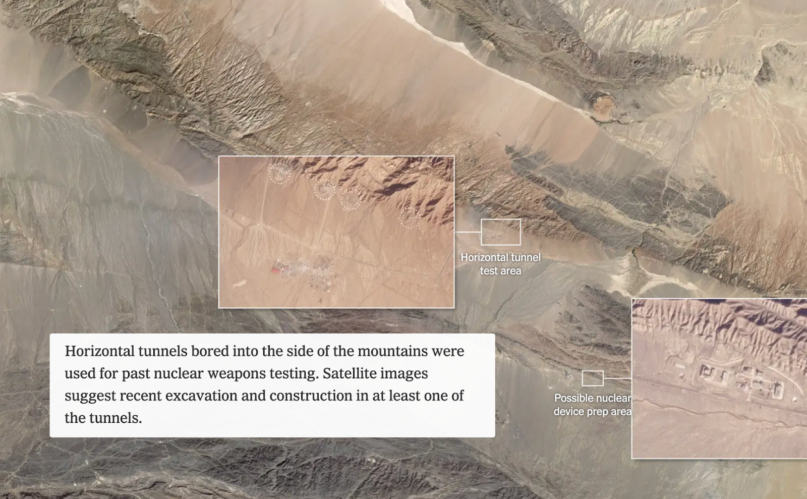
Old nuclear testing sites in Lop Nur. At the beginning of the article, there is a scrolling map which includes text callouts and inset images to show more detailed images of certain features. This sets up a visual for readers, and the action of the screen moving across the landscape allows us to get a sense of the scale of the project. The authors also labeled features that may not be obviously identifiable from such a distance, such as roads and tunnels, in order to facilitate readers’ understanding.
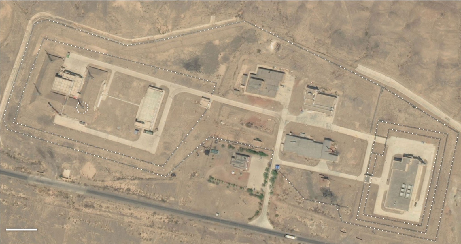
Facility in Lop Nur speculated to be used for nuclear-related activities. This image provides a closer view of the buildings and rural landscape and their muted tones, allowing readers to visualize the testing site at a more detailed level than the previous scrolling map.
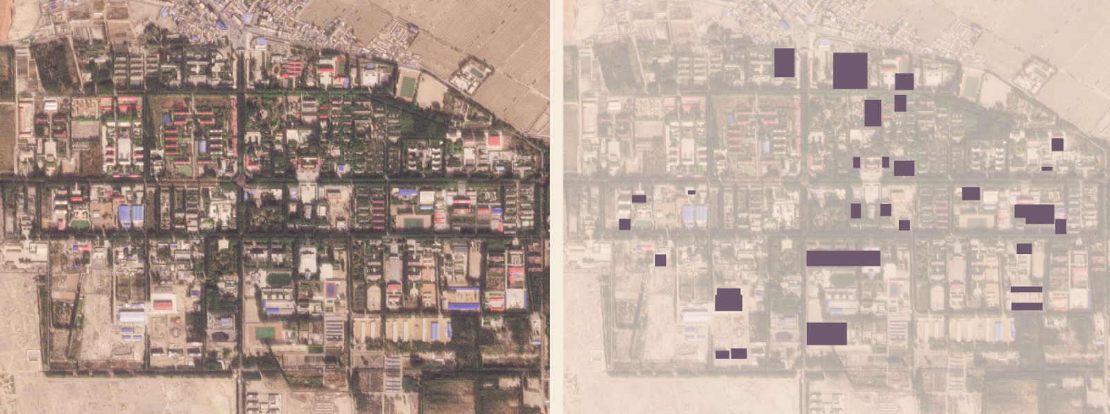
New buildings added or renovated in Malan, the nuclear support base in Lop Nur, since 2017. The map quickly conveys the amount of new facilities that have been put to use, indicating growth in the nuclear testing project.
The structure of this article is effective in displaying satellite images throughout and explaining how they provide evidence that China is building a nuclear test base in this region. The images are especially effective in providing a strong visual for what a nuclear testing site looks like, something that not all readers may be familiar with, and depicting change and increased construction over the last few years.
The use of remote sensing is important in this situation as it allows for the rest of the world to get information about something that China may not otherwise disclose, in a place that might not otherwise be accessible for journalists. This is something that raises security concerns regarding nuclear weapon use, and satellite imagery enables the development to be tracked.
One of the questions these satellite images do not answer is whether people are affected by this development. The satellite images show a barren, empty landscape around the nuclear satellite, but do not indicate where the nearest towns are and whether they are close enough for people there to be affected by health hazards from nuclear testing.
From the New York Times, “China Quietly Rebuilds Secretive Base for Nuclear Tests”
https://www.nytimes.com/interactive/2023/12/20/science/china-nuclear-tests-lop-nur.html

These images show the state of a seaside warehouse in Beirut, Lebanon before and after a massive explosion. The explosion was caused when a crate of ammonium nitrate caught fire. As the image shows a massive crater is left along with heavy damage to buildings around it. These satellite images complete devastation to the port and the buildings around it, along with a ship that was blown out of the water and onto the dockside. These images are important for disaster diagnosis and prevention along with emphasizing the importance of locating dangerous materials in a populated place.
https://www.wionews.com/world/beirut-explosion-created-massive-crater-at-port-satellite- imagery-shows-318495

These satellite images are provided by the China Land Observing Satellite Data Center. These images are the locations of two new COVID hospitals built in Wuhan, Hubei Province earlier in 2020. To counter the pandemic in Wuhan, the Chinese government decided to build two completely new infectious disease hospitals borrowing the experience from Xiaotangshan Hospital built during the SARS outbreak in 2003. The decision to build the first hospital, Huoshenshan Hospital was made on January 23. The construction began on January 25, and was completed on February 2. Shortly after the start of the construction of Huoshenshan Hospital, the second hospital, Leishenshan Hospital also began construction. Leishenshan Hospital was completed on February 6. The two hospitals had over 2,000 beds in total, they played a critical role in China's fight with the COVID-19 pandemic. These satellite images showed the huge effort China made and the Chinese people's confidence against COVID.


Source (in Chinese): https://www.thepaper.cn/newsDetail_forward_5842152

These images are from a study done at The University of Georgia to try to detect and treat toxic algae blooms sooner than was previously possible. The images show algae blooms in two different lakes in Florida and Nevada (Figure 1 and Figure 2). These images, along with on-site sensors show the presence of an algae bloom. The research team developed an algorithm to search social media sites where people may be posting about blooms that they cannot detect from the satellite imagery. Using information gathered from this algorithm, the team can look at satellite images of the water body to determine if there is a bloom. They then will alert local authorities to allow them to test the water to determine the toxicity of the bloom. Along with the algorithm, they also have an app that allows citizens to put in data all over the world. The research team hopes that between citizens providing local data, and their ability to detect blooms through satellite imagery, they will be able to sooner detect and treat toxic blooms across the world.
These satellite images show the stark contrast of the Angeles National Forest and the San Gabriel Reservoir outside the Los Angeles metro area from 2020 to 2021 and highlight the severity of the drought that the western United States faces. The top image shows the southern California landscape in June of 2020 in relatively lush vegetation cover and reservoir level contrasted with the image from this June below. In 2021 we see a dry, red landscape with little vegetation and a significantly reduced water level in the San Gabriel Reservoir.
California has experienced a severe drought for nearly a decade with little reprieve and just had its driest February in 150 years, leading to reduced snowpack and runoff that much of the state relies on for its drinking water.The dry conditions also escalate the probability of wildfire – something California and the western US have become all too familiar with in the last decade. Last year was the worst fire season in the state's history but with severely reduced rainfall and snowmelt and soaring heatwaves, it could easily surpass the record the state set in 2020.
The images were captured by the European Space Agency's Sentinel satellite.


Link to original article: https://www.theverge.com/2021/6/22/22545107/satellite-images-california-drought-water-esa
These images are part of an interactive essay from the New York Times that examines the amount of tree cover present in affluent neighborhoods of Philadelphia (e.g. Chestnut Hill, Fig. 1) and compares that to tree cover in formerly redlined districts of the city (Fig. 2). The authors (Ian Leahy and Yaryna Serkez) use data from maps to present fascinating visualizations of the amount of tree canopy cover in rich vs. poor neighborhoods, which can cause large differences in average temperatures (they report up to 10 degrees Fahrenheit) and affect the general wellbeing of residents. The interactive essay assists in visualizing the problem using effects such as highlighting key areas with polygons and labels. It's clear from the imagery used how many more trees exist in Chestnut Hill compared to the formerly redlined areas, indicating the continuing effects of discriminatory housing practices from decades ago.


Image and story source: https://www.nytimes.com/interactive/2021/06/30/opinion/environmental-inequity-trees-critical-infrastructure.html

Hoping to learn more about the ancient history of his country, a business manager named Dmitriy Dey began studying satellite imagery of Kazakhstan via Google Earth to find clues of structures created by his ancestors. What started as a hobby quickly turned into a large project that has inspired archeologists all over the world to study the sites he found by examining imagery and has lead to numerous theories on their origins as research has not caught up to say how old these earthworks are let alone which peoples used them or for what.
The image above and the project generally is controversial because Dey has discovered 260 features that he claims are upwards to 8,000 years old and part of a Neolithic sun cult, but experts warn the images can be misinterpreted without investigation on the ground. Geidre Motuzaite Matuzeviciute, an archeologist from the Lithuanian Institute of History in Vilnius, believes that only 55 of these features are ancient earthworks with the remaining created later by Turkish tribes. While these 55 still require ground teams to investigate, it's still very exciting that the patterns that identified these could only be seen with remote sensing and these particular features were only discovered because a 'layperson' had access to free data to research his personal interests. Whether or not these images are historically significant will be verified by later research and peer review.
Source: These Satellite Views of Ancient Earthworks Are Stirring Debate (nationalgeographic.com)
Like every year, the West Coast
wildfires are massive and devastating. Due to climate change, dry weather
conditions between California and Oregon have been the reason of tons of fuel
available to start this massive fire. In 2020, Oregon and California
wildfires have exceeded a record turning thousands of acres of forest area into
ash, making it the worst wildfire in the past 18 years. In Figure 1, you can
see the damage caused by Almeda fire made in Mountain View Estates, Oregon, which
it forced thousands of residents to evacuate from their homes, and where
approximately 30 people died during the wildfire. In addition, high levels of smoke were able spread through several East Coast states
in the US, even crossing the Atlantic Ocean reaching some Europe skies —getting repercussions on climate change. Moreover, NASA captured images tracking large
clouds of smoke and associated aerosols caused by the fire on its way through the states of New York
and Washington DC (Figure 2).

Fig 1. Mountain View Estates neighborhoods
surface destroyed by Almeda fire at Talent, Oregon.

Fig 2. Wildfire smoke spread from
the west to the east of the US.
Source: https://www.bbc.com/news/world-us-canada-54180049
Mapping of Mangrove Forest on the North-Western Coast of Guyana

The map above displays the
location of mangrove forests along the north-western coast of Guyana by using satellite imagery to detect the above-ground biomass. This is a product
of training sessions with SERVIR Global and relevant NGO and government
agencies to improve the monitoring of mangrove forests. This is an important
initiative because mangrove forest provides critical ecological services to
Guyana. However, there is very little data on the status of the vegetation
which is being threatened by climate change and anthropogenic activities. This
collaborative initiative is part of a bigger plan to protect and preserve the
ecosystem.
Source: https://servirglobal.net/Global/Articles/Article/2728/ensuring-resilience-for-people-and-ecosystems-guyana-advances-mangrove-monitoring-with-satellite-technology

Remote sensing in the media has become ubiquitous, with satellite imagery appearing in everything from the news to sitcoms to blockbuster movies, and even commercials. Given the varying levels of quality and interpretability, there is much to think about and discuss!
Wednesday, July 7, 2021
The Cameron Peak Fire burned from August - December 2020. To this day it is Colorado's greatest wildlife, burning over 200,000 acres in approximately 5 months time. Although the cause of the fire still remains unknown, its origins are still under investigation. In total, Larimer County (where Fort Collins is located) tallied over 450 structures damaged or destroyed. To add, approximately 30,000 acres or almost 9% of Rocky Mountain National Park were burned.
Fig. 1
Evacuations (mandatory and voluntary) west of Fort Collins, CO

Fig.1 Displays the evacuation outcomes for residents in mid-October 2020. This is image is important as it could have been used by residents to gain a better understanding of how they're being influenced by the fire. To add, this map, along with others supplied by Larimer County were updated regularly. This map can also be important for authorities attempting to inform future citizens about what can happen; as in all likelihood there will be more fires in the future.
Fig. 2
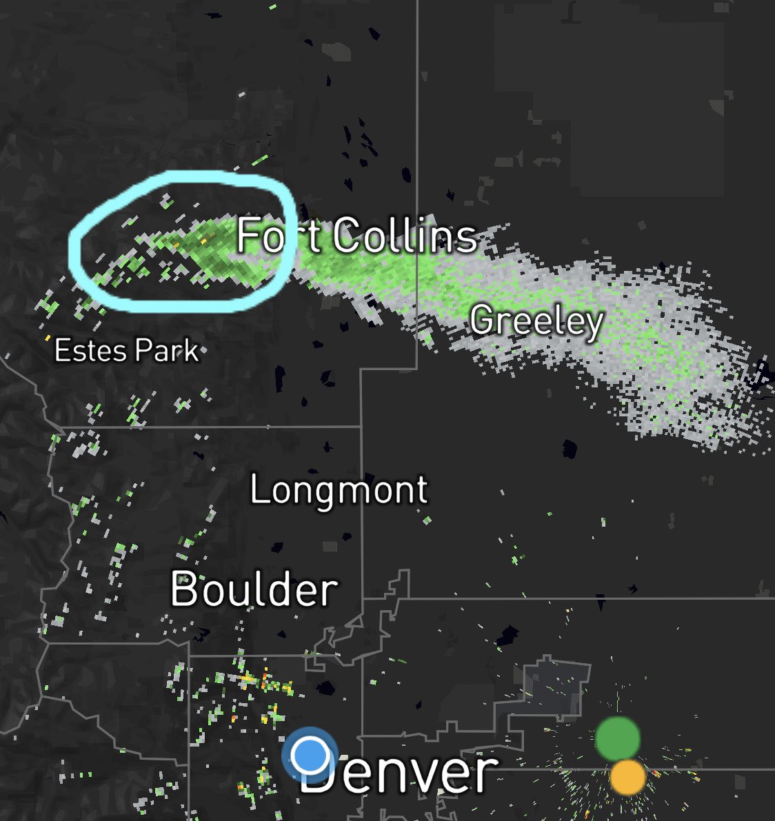
Smoke Plume of Cameron Peak Fire
Fig. 2 Displays the smoke plume of the Cameron Peak fire on October 14, 2020. This map portrays the extent of the smoke and is important to residents of the area, as they can monitor to an extent how impactful the smog outside their homes will be. To add, having this smoke information public is a valuable resource, as officials and the public will be able to compare its results to that of future or past events.